

"It's kinda long, but it's full of suspense...".
"It's kinda long, but it's full of suspense...".
The Making of a Cover & the Break This House Reveal

I was told a lot about the publishing process before I’d ever even begun writing my first book. And a lot of what I was told was about how little power I would have. How there are people with important jobs in big departments who will be making lots of decisions for me and how a lot of those decisions are determined by things I don’t understand. I didn’t understand any of that considering my thinking was this: It’s going to be my [GOT-DAMN!] book and it ain’t no way something I’m not happy with will make it to the shelves if I can help it. I’m controlling in that way. I’m an August Leo, a little bit type-A, and quite visionary. Let me explain:
About seven years ago, now, (I’m just guessing it was 2015 - what is time, anyway?) I was brimming with all kinds of ideas the minute I fully committed to the decision that I was going to write a novel-in-verse. That my debut novel was going to be one long poem broken up into many shorter poems loosely based on my life as a repressed first-generation Nigerian-American queer who was turned out (in the best way!) by college life at an HBCU. I was going to write about how art found a girl like me in the only way I knew how. I was going to fashion it after Jacqueline Woodson’s Brown Girl Dreaming and Jason Reynold’s Long Way Down. Anyway, my brain started going off, right? I knew what illustrator I wanted to design the cover. I knew how thick I wanted the book to feel in my hands. I knew how I wanted it to be marketed. My brain seriously couldn’t relax. So I text my mentor and I told him:
“I want [redacted] to illustrate my book.”
And the first thing he said was “Whoa, whoa, slow down” and something to the effect of me getting way ahead of myself and that I probably wouldn’t get to make that choice anyway. That it was too early to be thinking about any of that.
Deflated is an understatement. Hearing those words made me feel so sad because, amongst all the other things I’d been told, I was also well-informed that the publishing industry is hella white and, if that’s the case, how can I be sure this black coming of age story I’m writing will be represented the way I know it should be? How can I trust a process in which I have such little say? It was hard to accept. So I didn’t.
I’m hard-headed and I rejected that information even though I listened to the underlying message: “I don’t think this will happen for you because it wasn’t something that happened for me. I don’t want you to get your hopes up. Just focus on writing the best book that you can.” And, listen, it wasn’t bad advice. It gave me context for the world I was entering as an emerging black author with big ideas. And it made me come in determined, guns blazing. But I had to understand the history of the industry I was walking into and I had to focus on being a great writer before anything else. I couldn’t be green about the fact that several people will tell me no.
Let’s fast forward: a year into working with my editor on Every Body Looking, said debut novel-in-verse, him and I start to work on the cover. I still was scarred by the advice I had received some years back so I was a little afraid to be assertive about what I wanted. Imposter syndrome had me fearing that I’d ruin a good thing with my requests. So I tell my agent instead. And she says “it’s perfectly fine to ask to see Black women illustrators only.” So that’s what I did.
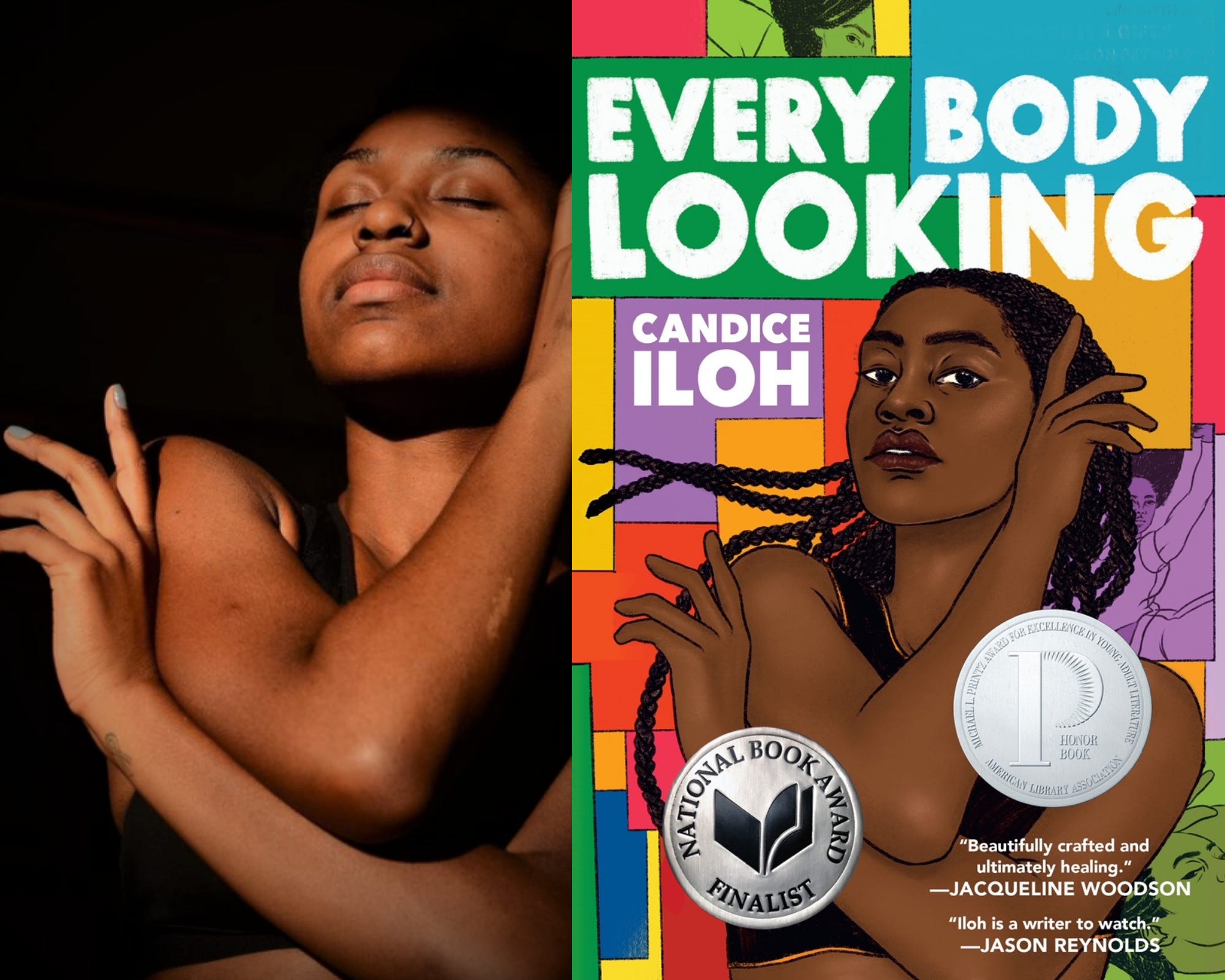
In comes a portfolio of seven Black women’s work to choose from. And the choices were so overwhelming I could have cried. We joked that I seriously couldn’t go wrong no matter who I picked. Me and my editor really began to bond from there, I think. Because there are so many incredible Black illustrators out there but he somehow narrowed it down to seven that spoke directly to the story I had written. It felt so fun and easy from there, honestly. By now you should know the brilliant artist behind the cover of Every Body Looking is Rachelle Baker, Detroit creator who is an undeniable talent now responsible for several book covers you’ve seen on bookshelves across the country. She made the process extremely enjoyable and her responses to my feedback, as well as her attention to detail, surprised me.
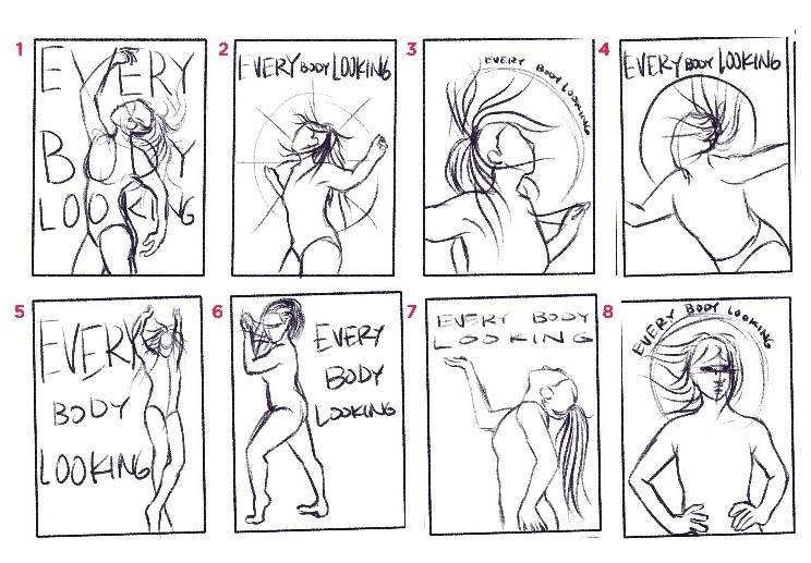
I started sending my editor pictures of Black dancers I love, my favorite Afrobeats videos stockpiled off Instagram, and YouTube video clips referencing some of the scenes I’d crafted. We talked often about boldness and color and movement. We unpacked what I wanted the cover of my very first novel to say. It took about 3-4 rounds of sketches and we landed here. Isn’t she lovely?
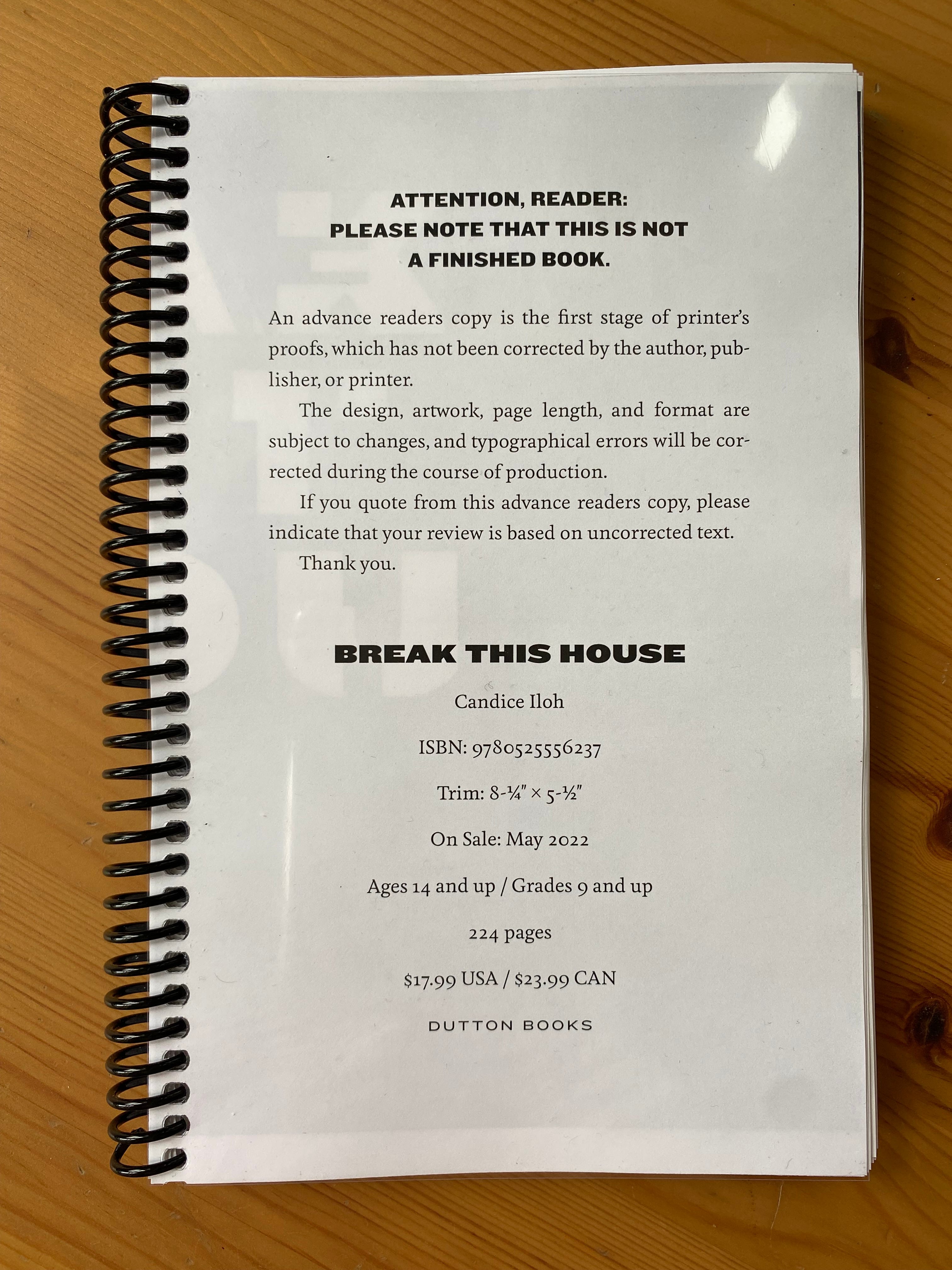
Alright, still here? Cool. Told you….full of suspense. Fast forward to the end of July 2021 and I’d just turned in the final draft of Break This House (my second book!) and it’s time to start the cover-making process all over again.
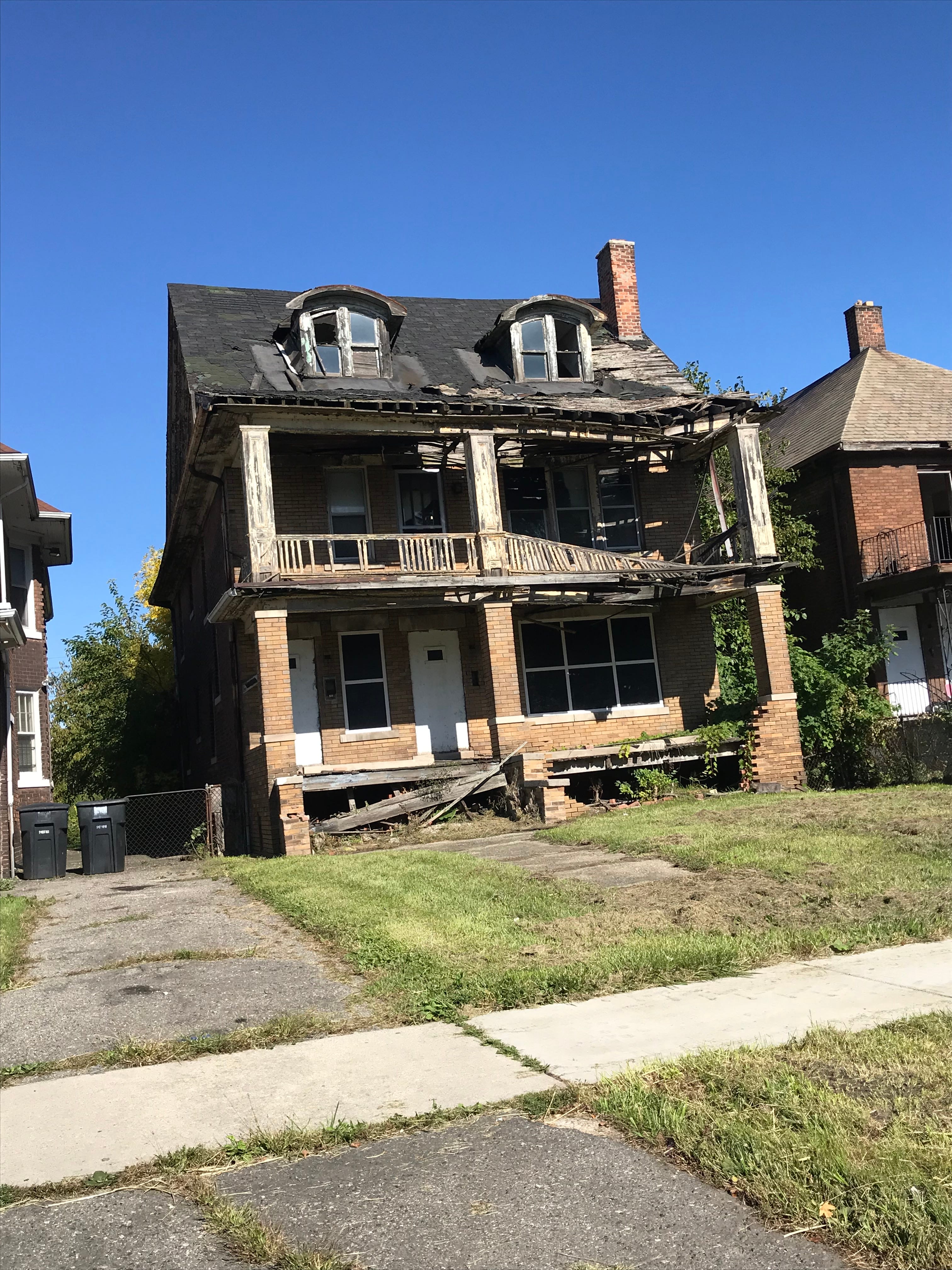
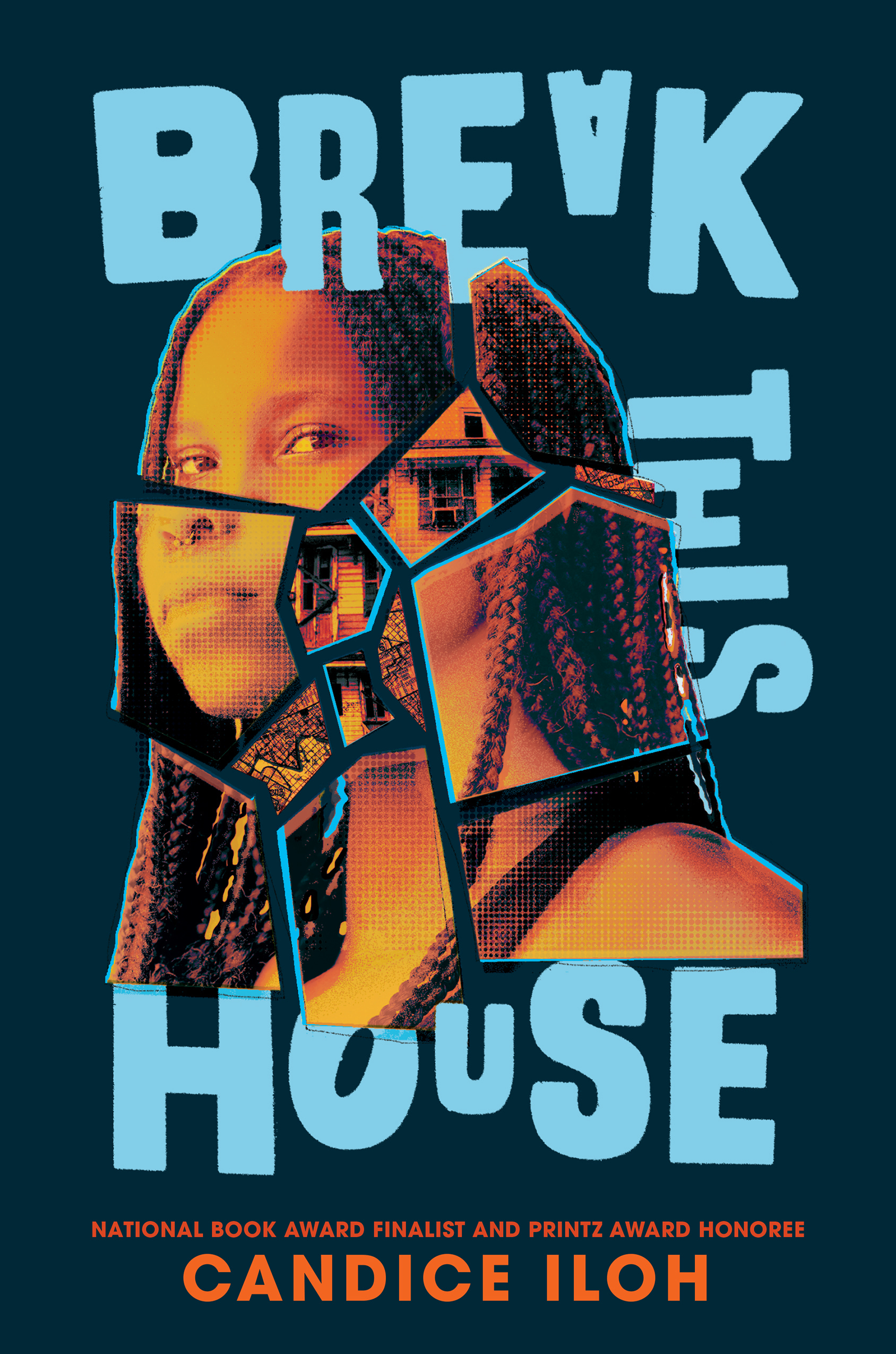
My editor followed the same drill except this time the portfolio was comprised of Black artists of many genders, including photographers, collage artists, graphic designers, etc. And that made sense. The direction would be different. I wanted something dark and twisty. Some borderline spooky shit (I said this to my editor verbatim and he gets me so he understood what I meant by this, thankfully) and that changed everything. I thought it would be like last time 3-4 rounds max. That the first round would be OK. The second round, NICE, WE’RE CLOSE! The third round GREAT! But can you change this?…. Didn’t happen like that at all. It was a challenge and a lot of that fell on my ability to convey what I was seeing in my head (which was way less clear than last time) and how it might clash with sales. After all, we want people to buy the book, not scare them off, you know? All my studies in marketing and PR at Howard didn’t do a damn thing for me, though my editor argues that I’ve got a decent eye for this stuff. I wasn’t so bad at vocalizing what I want either. S/O to all my mentors. And big shout outs to Yaz Monett, the super talented Toronto-based illustrator who ultimately took on the challenge. We chose her for her refreshingly strange, colorful collage-style composition that I felt spoke directly to how I want readers to feel when they see this cover.
Publishing optics are still a big fat enigma for me so it was tons of back and forth about whether things were too abstract, too on the nose, too much pink, too dark to be visible as a thumbnail, what was trending blah blah….I hated it so much cause I just be wanting to do what I want to do, no matter how “weird” it might seem. I wanted to dismiss the idea of going with something just because it had proven to be successful for whatever surface reason. I felt like, just like me, the general public is bored with seeing the same things even if they worked once upon a time. But I learned so much about that last part: book cover trends. God, you would not believe how many YA book covers with mustard yellow backgrounds are out right now and I was at risk for being number 3651681 (for real, I’m about to show you in a second). No shade, but I didn’t like that. Leo rising here, hi. I live for being special. I am not okay with being at risk of blending into the background as one of many similar-looking novels. I didn’t want anything pink either. As a former classroom teacher who knew it would be dubbed a “girl book,” even though no gender owns the color pink, I couldn’t risk it. I just knew what would happen with it in a classroom and, when you read this story, you will understand why that simply is not gonna work.
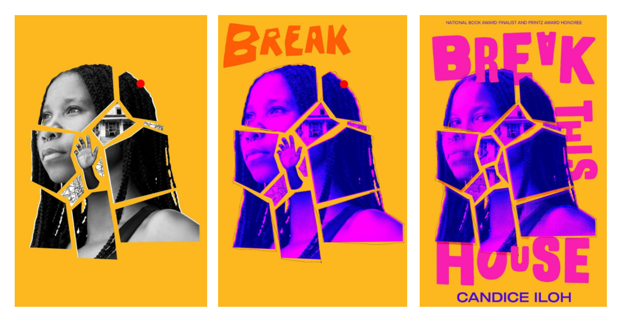
So let me save you the rest of the boring back and forth and tell you this: there were lots of conversations about which covers sell, which covers get looked over, and which covers get specific gendered responses and it overwhelmed me as an artist still having to engage with the corporate aspect of this industry. But I was stubborn about it. Cause it’s MY book but I want MY book to SELL. There were several drafts that I thought were THE ONE and, to my utter disappointment, they weren’t. I wasn’t the final say and, to be quite honest, I thought me and my editor were beefing for a little while (ha!). We both felt strongly about different sketches. It got pretty intense, friends. But we ultimately reached a compromise. After all, he became my editor because I thrive off collaboration and I signed up to spar with someone who wants to get it right. Sparring brings out the best in me.
Right now there is a mock-up poster in my apartment of about 16 different colorway versions of the cover we eventually landed on for Break This House. The one we chose wasn’t nearly the cover I thought it’d be but I am in love with it. The right choice rose to the surface. I couldn’t be more happy to introduce you to Yaminah Okar, 16 year old Brooklyn expat from a small, forgotten city who’s just found out the absolute worst news about her estranged mother on Facebook. Come May 24, 2022, you’ll get to find out the rest of the story. But for a sneak peak of chapter one right now, go here and to pre-order GO HERE! Until then, cheers to a final draft:
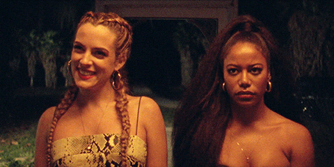
*The title of this installment of Break This is is from Zola, a very chaotic feature film that I loved. You can watch the trailer here!
Fabulous first newsletter and so many gems dropped too! Looking forward to the next installment!
Candice, I loved reading this and I'm so glad you didn't allow someone else's story to quiet your voice. Rooting for you ALWAYS!